Thursday 30 June 2016

Reviewing Photographs

In the shots shown below I have used a Canon EOS 600D with a lens of EF-S55-250mm f/4 -5.6 IS II or EF-S18-55mm f/3.5-5.6.6 IS II


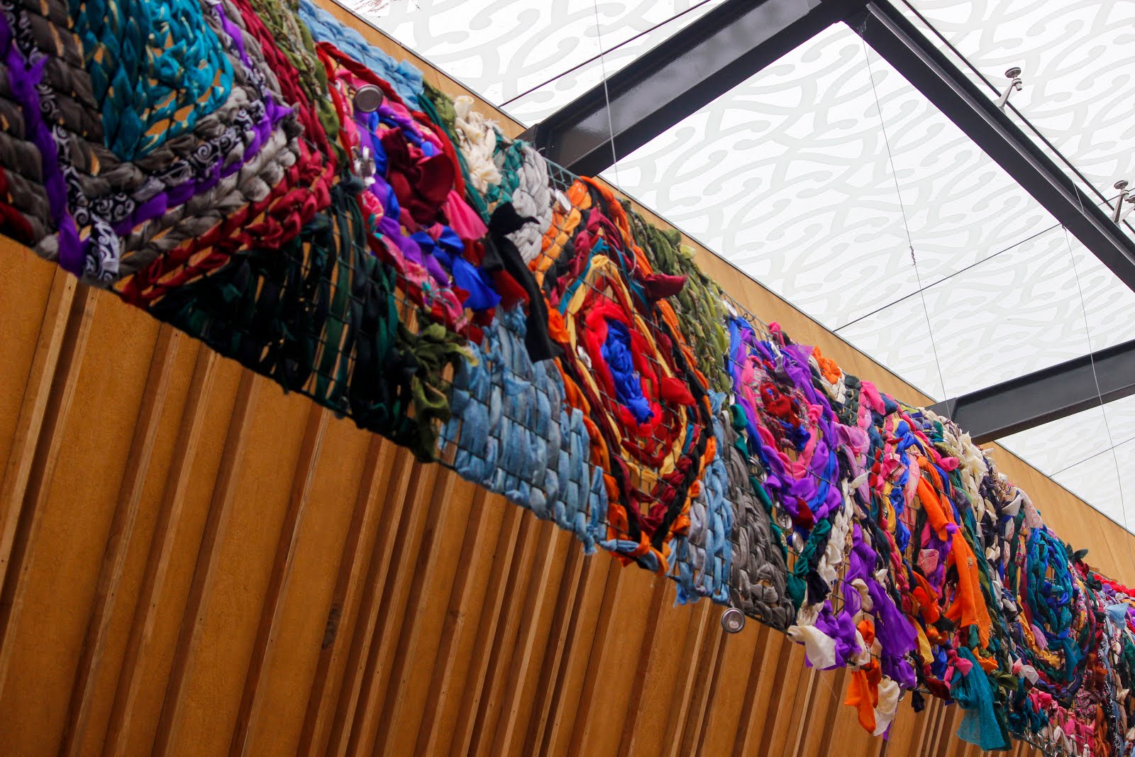
  • Close up shot of the 'ika' out in the Otara shopping centre.
  • The composition of the blue panels that hold up the 'fish' are in centre and you can see it through to the end.
  • Over exposed in the back areas.


I had another shot like this but it was over exposed. Like way over exposed that you couldn't see the birds.
I like that the birds are just chilling up there.
Camera looking up. I tried to add the centre of the fish in the centre of the frame.


I think I would want the colours to stand out more but being able to photograph the shops out in Otara is a must. I see repetition. I can see that I'm not standing right in front of the shop. I'm at an angle. The photograph is blurry. 


I love this photograph of the birds. In camera raw I was able to increase the saturation so that the colours on the feathers stand out more. I was able to get close enough to take a still shot of them. 


I was then able to walk towards the birds so they could fly. I wanted to take a shot of them flying away. I was then reminded that I had a long lens so the photos I took look a bit like this. But I like how this photograph has turned out while using it. In camera raw I increased the saturation. I like the motion blur as the birds flap their wings. 
I dislike the background that the birds are flying against in this shot. Doesn't look appealing. 


  • In camera raw I increased the saturation.
  •  The colours stand out more now. 
  • Camera looking up.
  • I like this shot because it's a close wide shot of the 'mat'. I did take a few other shots with the full length of the 'mat' but being able to see less is more. Especially if you are able to see more detail. Seeing the full shot is distracting as there are other objects that come into the frame.
  • The photograph would of looked really good if there was shallow DOF at the background. So like the 'mat' was the only thing in focus. Maybe photo shop or camera raw is able to do this.

  • I have edited this photo so that I was able to see the birds more clearly.
  • The original photo was over exposed.
  • By decreasing the exposure in camera raw I was able to fix the over exposed photo.
  • Camera angle looking up.
  • Birds seem sharper.
  • Edited in camera raw.
  • Increased saturation so that the green grass had more colour to the photograph. Reviewing it back now, it doesn't look that much alive, photograph wise, but I like angle of where this photograph was taken. 
  • The colours on the 'Welcome to Otara' board stands out more.


I like the emptiness of the photograph. 
I tried to make the composition of the photographs even by showing the two speed limit poles opposite asymmetrically from each other evened out in the frame. (If this makes sense)


Camera angle slightly upwards.
I used a 18-55mm lens to take this shot.

This photo is like those typical Otara shots. But I like that this is one of those photos that everyone has to have because it represents Otara. (In a way)
 'Home of Tara'


Because this just showed up on the news.

Artist: Warren Richardson

http://www.loeildelaphotographie.com/en/2016/02/18/article/159891455/warren-richardson-winner-of-world-press-photo-of-the-year-2015/

Such raw and captivating photographs. (While he was in Hungary)
It's inspiring. Being able to see and learn from other photographs what they capture and deeper meaning behind a photograph.

Wednesday 29 June 2016

Before installation day


Buddy preparing for installation day.
The way he prepared everything was good and the fact that he thought of everything is great. Like what he is adding the shirt into. (shown in photo)


Kendra and I were able to help out Pascal prep for installation day by holding the screen against the windows as he spreads out the ink. Pascal was able to ask us for feedback.

Sunday 26 June 2016

Reviewing my photographs: windows and reflections


This photo reminds me of an earlier research where I wanted to manipulate my photographs but I wouldn't have enough time. You are able to see the reflections from the windows added into the frame.


I like the distractions of the window frames and that you are able to see a lecture having a convo with someone else. You are also able to see reflection in this photo as well.


Research from Rebecca

http://www.ideastap.com/IdeasMag/the-knowledge/photography-ethics

(My response/answers relate to my photographs taken for this project.)


What I've understood/learnt from this article:

Appropriate times to take photographs of others.

Most of the time I don't take photographs of others because I feel like they wouldn't want to be photographed in that situation. e.g if they were eating. I miss a lot of amazing shots by not being quick enough to capture it. I enjoy knowing that people allow me to take photographs when they see me taking them. It gives me that boost to take more.

This experience of street photography has been good. I was able to be ParkupOtaras 'photographer' in our team. I was able to go around and take photograph of others.

Taking a candid is much more real then telling/asking them you're going to take a photo.
You can see the difference when taking the different shots. When it's candid, they're in the moment. When I tell them, they get shy and won't want to be photographed. But then I guess if I've told them I can have a formal kind of photo. Where they pose for the camera.

Why you do it. Why I do photography.

What is used to make your photographs. Like editing after a shoot. Photoshop. or just set up a shoot knowing that your photograph won't need retouching. 

Posting photographs in a public space with out their permission? Uploading them.

Tuesday 21 June 2016

Warehouse Stationary

Went to Warehouse Stationary early this morning to print out 2 of my 3 final photographs.
The lady there said it would take 40 mins to finish my two A1 matte photographs.
So today for self directed time I was getting ready to install my photographs for this evening.
Got the keys from Debbie and got some help from Rebecca with the window props.

I thought since I had the keys and my photographs were ready that I would install today.

Went and picked up photos, and installed the 2 photographs. As they were hung up I noticed that the chosen photographs were taken both on Lovegrove Crescent. Which gave me an idea that maybe I could relate my photographs to Lovegrove Crescent. Which is still part of my concept being Otara.
But na, just going to stick with Otara.

I chose the size A1 because it was the biggest printing size I could afford. I'm quite happy with the size (A1) although it does look 'not filling' up in the Otara windows.

I have chosen to have the final photographs in colour because it is more appealing. Black and white photographs would suit if my photographs were focused more on one thing. But since my photographs are landscape (so they're wide) and include the community, in a way, I thought it would look better in colour. There is more going on for it to just be black and white.

What to do next:
Take new photos.
Review them.
Choose one.
Print last and final photograph.

I've actually left the middle window empty for the last photo. I had a shot in mind that I want to take that I would want in that window. It would kind of tie my photographs together in a way.

Reviewing my photographs: Old photos

(Not recent photographs. These are a mix of old photographs, taken for this project.)


Not quite sure what was happening here.
A bit of motion blur as one of the boys raise their arm.
White areas are over exposed.
Deep DOF with everything in focus. 


There was no one on the bus so I thought I would take a photograph of nobody in it.
I'm not liking the vantage point. It looks a bit bland. Not interesting. The yellow poles that you are able to see are distracting. They are repetitive. The repetitive of the poles is dizzy like. I think taking a photo while in the isle gives it that 'look'. Look being: 'pulls you in'. 


Taken on our way back from St Pauls Gallery. 
Heading towards Otara Road. 
Shallow DOF photograph where it's only focused on the rear view mirror. You can see Rebecca' eyes. Vantage point: Camera aiming straight.
I zoomed in for this shot.  


Similar picture to the top (Rebecca Hobbs) photo.
She should be looking straight ahead aye. 
Over exposed in most areas. (These over exposed areas are just...)
Light bulb moment: Series. I like series of photographs that look similar to each other. Like if I did a series of rear view mirrors. I think I've done something like this earlier though. With the human subject placed on the left or right side of the frame. (The 'avoiding viewfinder' post)


Out of focus asf. 
When you click on to the photo you are able to see how out of focus the photo is. Nothing is focused. It's like i'm learning nothing. But I am, But I AM. I won't be fast enough to take a photo of something/someone in motion. Which is a skill a street photographer should have. Maybe setting the camera to just taking photographs of freeze movement would've helped. If I did like a series of them. 


This would've been a better photograph if it was a close up shot. 
Thought of the moment: I have more bad photos then I do good. 


Yea nah, Big no. 
A mix of motion blur and out of focus shown in this photograph. A portrait shot would've looked better but no guts.

Monday 20 June 2016

Reviewing my photographs


A lot of empty space around the guy who is caught walking. 
Over exposed around the cloud area. 
Deep DOF photograph.


I really like this photo of Yana smoking. I like that it's taking with the camera behind the fence, getting her in between the frames. What ruins the photo is that it's not focused on her smoking. It's focused on the background. The shallow DOF is on her face. 


I like the way the light from the windows reflect onto the ground. I dislike that it's over exposed in the window area. 


I hate that I've captured the car into the frame. It's pmo. It kills off the photo of what he is trying to do. Maybe a close up would've been a better shot, even if the vehicle wasn't in the frame.


Two people catching up in front of a bakery. 
Subjects are centred in the middle of the frame.
Camera vantage centre.

Ideas that come to mind (Whole post in general): Repetitive. Capturing photographs of those who do something in this community. Like 'the help' in a way. Cleaners, security, or just workers in general. Shop keepers etc. After work hours, adults finishing work kind of thing. Buying dinner. Morning shots. 

Sunday 19 June 2016

Dear Diary kinda thing

I got reminded by Francis last week about the windows. I didn't realise it was the next week. I need to print out my final photographs and hang them up on Wednesday (22 June) morning (hopefully, I can set up the photographs anytime during that day). I went to warehouse stationary this afternoon, near closing time. So I wasn't able to print any photos. I will have to go in tomorrow. I have a full class tomorrow so I will have to do this during my 1-hour lunch break due to finishing late but if I don't go during lunch I will have to go after class. This gives me at least 2 hours at Warehouse Stationary.

I have decided that I will go with my original plan and print out 3 big photographs. It will be pricey. After thinking about it more I realised that 2-4 photographs on one printing paper will be too small and the photographs won't look appealing, I guess. Like it will look nice if the photos were big.  

I was thinking that I should go to the windows and try out with different sizes of papers but I will be sticking with the 3, probably A1, photographs. Because time. 

Tuesday 14 June 2016

Extra thoughts

Experiment more with editing photographs to black and white.

WORK OUT SIZING!
Having doubts about the size of my photographs.

Went and checked out the size the other day and maybe one photograph for each window is too much, 'worth my money' wise.

I think I would rather pay more if I had more photographs on one printing paper. So I might not print one photograph for each one window.

Might have 4 photographs on one paper. So 4 photographs on 3 separate papers. That's 12 photographs in total.

I should start having my final photographs by next week.
And I should start working towards them right now.

With the photographs I already have, I will be doing test prints.

Need to go check out the place in Manukau, where I will be printing.

Check price.

All my photographs will have to be in landscape.
But then maybe if I choose portrait I could have 3 photographs, or more depending on size, on one paper.

Research Ideas: Manipulating

https://www.flickr.com/photos/mr_wood/page4/


I could manipulate photographs to look like this or something

Having ideas that maybe I could manipulate my photographs somehow.

but saying this I don't think I will have enough time to experiment this. I would have to think of the different shots I would need to take to manipulate the photographs, so that it could work together or something.

I could research more into this during free time, to determine the time frame,  if I do go along with this or not.

Reviewing photographs: Yana


Over exposed around her face.
Shallow DOF in the background.


Deep DOF. 


Shallow DOF in the background which gives the photo a nice look. Making Yana stand out more.


Over exposed.
I don't like how her arm is cut off. 


Too dark.
Composition is bad.


I notice that when I take photographs, I capture them from the side or have them placed on the side of the frame. 


Thought:
Need to take different angles and take more photos. I've been slacking, technique wise, but then I can see the type of shots I do. 

Monday 13 June 2016

Reviewing my photographs: Avoiding viewfinder eyepiece

These photographs are taken without me looking through the viewfinder eyepiece.
Like photographer Jay Giampietro who takes photos with his iPhone from his ear.
I got to use a classmates Olympus digital camera. Lens: OLYMPUS M.14-42mm F3.5-5.6 II R.
The camera was nice and small so I was able to experiment taking photographs without looking through the viewfinder.
I got to take photographs without being all up in their face or them knowing I was taking a photo.

Downsides of not looking through the viewfinder:
Wouldn't be able to know if I needed to:
Zoom
Focus
Add shallow or deep DOF
Add or take objects in the frame, away or in the frame


Dislikes:
Open sign is not the main focus. Like it's not the first thing I look at. 
Reflection being a distraction. As well as the other signs on the windows. 

Would've looked nice at night. With just the lights of the open sign showing.


I liked how the bags were laid out in front of the store.

Dislike:
Where I'm standing because the bags aren't in the centre. 


Dislike: 
Too zoomed out.
Zoomed in would've been better. 
Too much space around the subject (man).
The over exposed in the background. 


I like that you are able to see the client.
Would've looked nice if I added the name of the place.
Could've stood back a bit.


Said hi to her as I took this photo. 
I like how she's standing there, holding onto the door. 
I like the way she stares into the camera as well.


I kinda like this photograph. It reminds me of those boring professional photographs who take not so professional photographs but yet they are, in a professional art way. (if that's even a thing)

Dislikes:
Over exposed

I think I like the angle but idk. It think it works. You can see the lady adding more food to the trays. All that oil though.


Little kids playing. Adore.
I don't like the wide shot of this. 
Maybe focusing on one kid would've worked. Although I do like this photograph.


random thought:
Look up street photography without people


Reviewing my photographs: Avoiding viewfinder eyepiece

As I review my photographs from this day I've noticed that every single person I've captured was on either side of the frame (left or right). Giving them a big amount of space around them.  Negative space.
These are the set of photographs where I wasn't looking through the view finder.

These photographs are taken without me looking through the viewfinder eyepiece. 

Most of these photographs have something in common that I dislike.

There is a lot of space in these photographs. I dislike how much space there is but then I feel like it provides more depth (if that's the right word to use) to the photo. Like if it was a portrait of them walking, it would be like, 'where are they going?' kind of thing. But then maybe a close up wide shot would've been helpful in most of the shots. 

(A few of the dislikes I have mentioned under each photograph can be fixed in Camera Raw though.)


Dislikes:
That it's not straight. 
Over exposed in the top area.

The pole of artwork that is placed in the corner of the frame, it's irritating. 
I like that I've captured him walking in front of a store, that is seen clearly. 


Like maybe a close up wide shot would've looked better here. 
I like that you are able to see the shadow and the light. 

Dislikes:
Motion blur.
Too much opened space. 
Placing of where the little boy is.


Dislike:
That the top of the man is cut off.

Other than that, I really like this photograph. 


I kind of like this photograph. Although the man on the side is dark. I like that the light is more focused on the foreground (art wall, fish head). It makes the photo stand out, giving the man covered in the dark more impact. (If that makes sense.)


Dislikes:
Too much space
Angle. Where I'm standing to take this photograph.
Composition.
Over exposed.
Out of focus.

I wouldn't be able to stop and actually take a photograph of him if I was using a big DSLR camera.  Like a real intense photograph. So being able to use this camera was a way I could take a sneaky picture.


Way too much space. 
Camera angle is low.
Man walking towards me is lost in the frame.


Dislike:
Over exposed.
Where I'm standing. Makes the composition look crocked. 


(The girl in pink liiike)

She was with others who were also in pink. I wanted a photo of them but this was the closest I got. 

Dislike:
Over exposed. 
Composition is bad. 
Photo is almost like I wasn't focusing on the little girl. 


Doing her job kind of thing. 

Dislike:
That damn tree. It blocks off the photo in a way. Like yea, distracting.
Over exposed.
If only the boy on the bike was a bit closer.
Those birds would've been cool too, if the composition was right.

Just had a thought (Try different lens)


Everything is in focus.
The colours on the left stand out.
It's not a bad shot, in a 'didn't look thought the view finder' way.


This was like a once off experiment (I'll probs end up doing it again). Because taking photographs without looking through the viewfinder is like missing the perfect shot. So yea. But this is good, so I will be able to go over my photographs and see what I need to fix up on. Such as knowing what to do when I go out again. 

Like...looking through the view finder.
Setting up and taking time to set up the frame. Like really see if everything is focused or shallow DOF is in the right areas etc. etc. etc.

(Lens: OLYMPUS M.14-42mm F3.5-5.6 II R.)