Friday, 1 July 2016

FINAL


(Photos were taken by classmate because no camera)

Location: Exterior wall of Otara Family & Christian Health Centre.
5/120 E Tamaki Rd, Otara, Auckland 2023


From top to bottom, this is the order of the photographs shown in the windows. (left to right)

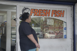
I wanted to choose the photographs that represented Otara.
I knew that the middle window had to have a representation of Otara. Whether it be something the public recognise in Otara or a background where Otara is written on. 
I wanted the public to be able to have a feeling of what I was trying to do.
The middle photograph ties in the other two of my photos. 
Shows the community of Otara. 

Reviewing photographs


I was able to take photographs at ParkupOtara last week Saturday.
This could also be used as an experiment with night shots.
I like the how dark the photographs are.

The experience was great.
The night turned out really good.

Being able to take these photographs at ParkupOtara has reminded me of those photographers who take really raw photographs of true and real situations, like photographer Warren Richardson.

Reviewing photographs


Love this photo of the cleaners equipment.
Likes:
The way the trolley is placed in front of the A door.
The blue trolley against the white walls.


When I took this photo I knew I had to have something that represents Otara in one of the windows.
This is a bad photograph because of the blur. I like how those guys are standing against the wall. Like just chilling in front of the bakery.


Dislike the amount of space there is behind the bus. The colours of the bus stand out and being able to see that it's a school bus reads something.

Original & Edited photos

Original photo
Made it straight, cropped and increased saturation
Original photo
Made it straight and increased saturation
Original photo

I just made this straight.

Test Print

I was able to do a test print when I only had two photographs up. I wasn't able to take a photograph due to not having a camera or a phone with a camera.

But the test print was A1 and in matte.


This was the photograph I printed out as a test print.

I was able to choose out of Matt, gloss or cardboard kind of feel.

Reviewing photographs


Canon EOS 700D
EF-S18-135mm f/3.5-5.6 IS STM
35.0 mm

Taking photographs while sitting in the car. 
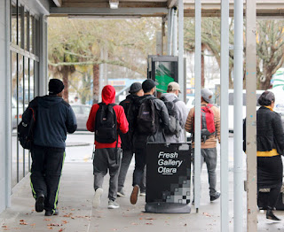
I noticed that I could take photographs of people walking past the shops that I was parked in front of.
There are a few bad photographs which show parts of the car in the frame. 
The colour of the photographs seems cold. I like these series of photographs with the public walking by, using the same background. 

Reviewing photographs

In the shots shown below I have used a Canon EOS 600D with a lens of EF-S55-250mm f/4 -5.6 IS II or EF-S18-55mm f/3.5-5.6.6 IS II

I have used my skills in Camera raw and Photoshop to edit my photographs.


Booooots. 


Looks squashed. Like how the boys fit right in between the tree and the rubbish bin.
Lunch breaks. Blue.


I have made a contact sheet of the photographs I have edited in camera raw. 
Communication between two or more people.
They fulfill the photographs in a way.
Portrait photos actually make a difference. Too much ground space. Like the amount of ground that is in the frame is distracting.
The poles in the foreground are annoying. It distracts the photograph. 
I've cropped a few photographs from a landscape to a portrait. 
I've edited photographs in camera raw and on photoshop.
Landscape shots that have been cropped are much more effective in a portrait landscape. 
The artwork colours stand out and I was able to increase the colours in camera raw. 
Photographs have shallow DOF, blur, motion, cropped, colour. 

(I was going to have the original photo side by side with the edited but then I remembered contact sheets.)